Refactoring UI
Table of Contents
Refactoring UI
I finished reading Refactoring UI by Adam Wathan and Steve Schoger today. It’s a quick read — took me about an hour and a half, even with some distraction breaks — and I thought I’d try putting some of the (really great) advice into practice.
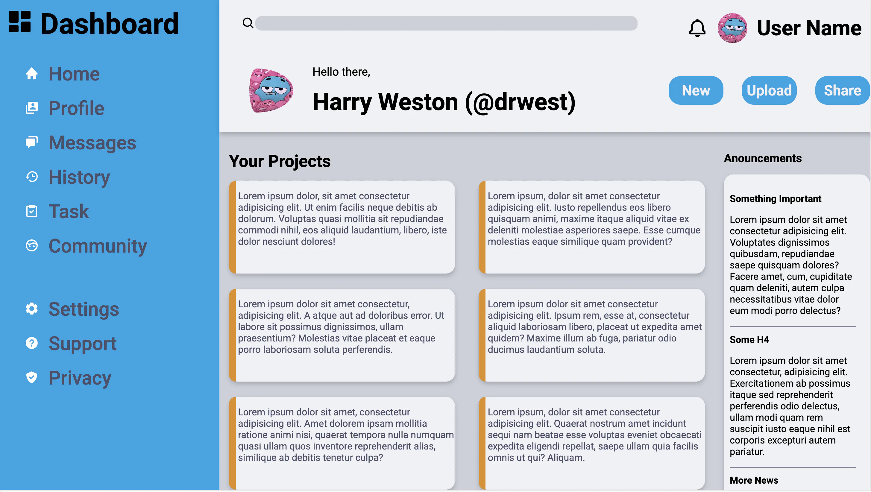
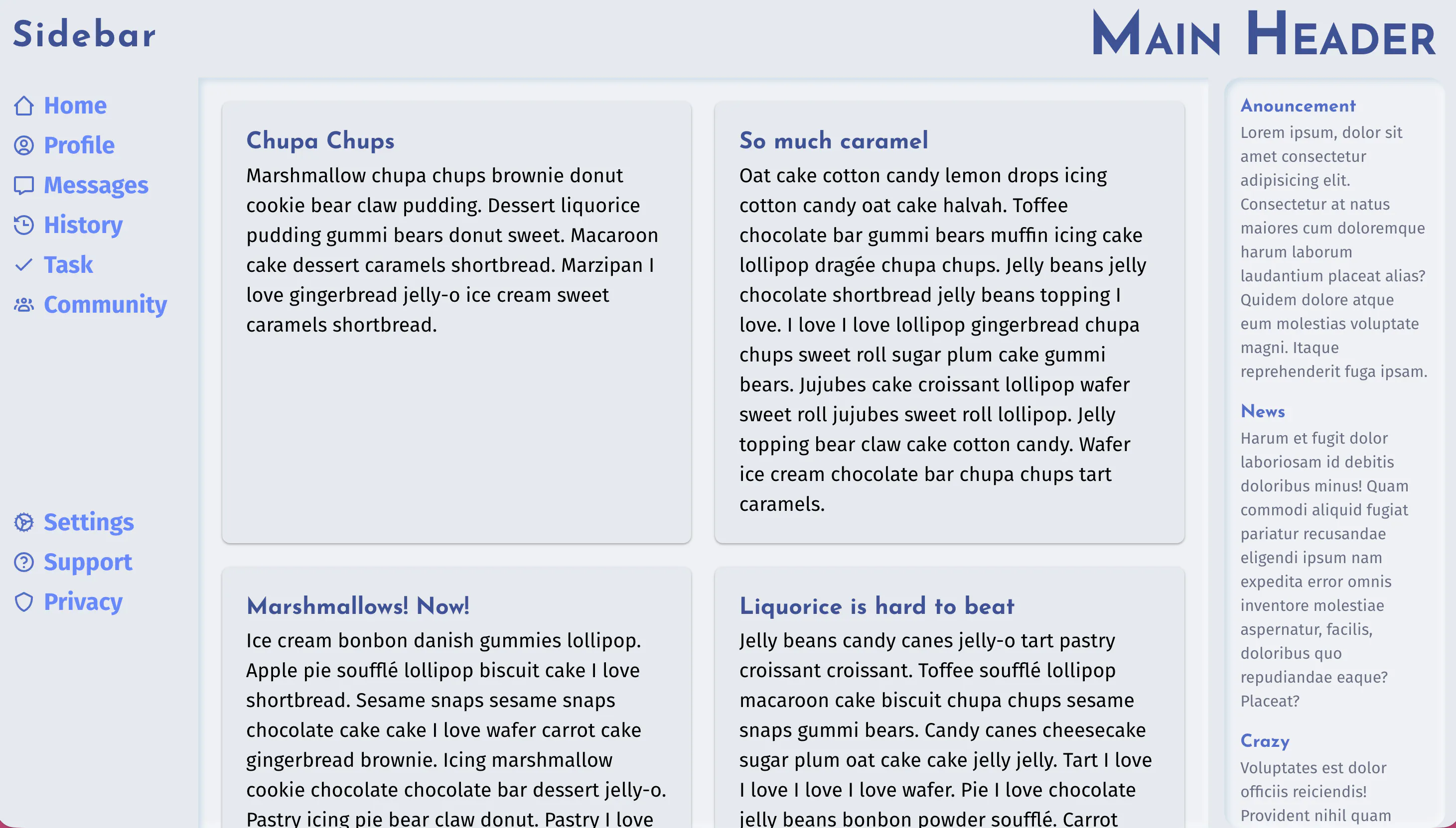
So I revisited the Odin Project’s Admin Dashboard exercise I did a while ago and gave it a quick redesign.
What I Did Differently
I focused on three key takeaways from the book:
- Less is more
- Set up your systems before you start
- Start in greyscale
So I began by creating a few CSS variables: a range of text sizes (didn’t end up needing most of them yet, since the design isn’t responsive), a matching set of spacing/sizing values, two font weights, and two font families. Then I started designing — in greyscale.
How It Went
🎨 No Colors
That was definitely a new experience. I had to keep reminding myself: no colors until the basics work. My instinct was to reach for “let’s try this in color X,” but holding back forced me to focus on layout first.
Still not fully happy with the result, but it feels like a step in the right direction.
📏 Scales & Systems
This also took some getting used to, though frameworks already train you to rely on preset values. Defining my own system up front worked surprisingly well — especially for margins and paddings. It stopped me from tweaking pixel by pixel and made the design feel more consistent and predictable.
➖ Less is More
I tried to keep font sizes and especially colors to a minimum.
This is advice I’ve heard before, but sticking to it is the hard part. This time, it worked out better than usual.
Before & After
And since images say more than words:

